It is always great fun to try and find patterns in vast amounts of data. Sometimes you find causation, other times just spurious correlation, but it’s a great excercise and the insight you get can be surprising.
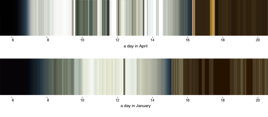
For a while, I have been wearing a light sensor that measures the surrounding light. The light that is around us, everywhere we go. It’s intensity and color. These graphs below are just two data points from January and April. Each horizontal pixel represents one minute, with data ranging from 6 am to 8 pm. You can see how the light changes from winter to spring, but as I know my daily routines, looking at these data reminds me of the course of events on the represented days.
Changes over time can be shown well in a time lapse animation.
There is one time lapse that I am a bit anxious about, and that is of my face. Every time I wake up my laptop, the front camera makes a photo of me, searches for my face, alignes it in the center, blends with previous frames, exports a video of the last months’ changes and uploads it to this website. While every photo in itself is a horribly lit, tired depiction of my face, the average still looks surprisingly acceptable.
From the timestamps on these photographs I extracted data on the frequency of sleep/wake cycles of my laptop to see what data I can infer from it. Naturally, while travelling I open and close the lid of my laptop more often than when staying at home.
I compared this data with the amount of e-mails I sent in the same time frame. The horizontal axis representing bi-weekly intervals from September 2016 to September 2017.
There is low correlation between the two activities, though it can be interpreted as “when the amount of e-mails rises, higher activity in the next weeks is to be expected”. Which sounds plausible if not very surprising.
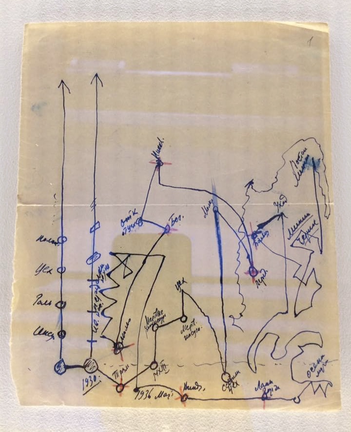
This is all well and good. But like with every other media, the most expressiveness in data visualization can be achieved by breaking the established rules. Below you can see the quintessential and most tragic piece of a recent Moscow exhibition about Michail Bulgakov. Bulgakov was a great russian and soviet writer and playwright, mostly known for his novel "The Master and Margarita". Like many writers in stalinist Russia, he had difficulties getting his work published, and even his successfully published novels were often torn to pieces by critics. Towards the end of his life he tried to leave the Soviet Union, but was not allowed. He died in 1940. The image is called "The diagram of fate", and was drawn by Michail Bulgakov himself.