

Exposition is the process of arriving in a movie, arriving at the characters’ vantage point, arriving in their space.
I shot this short film with Mira and Matina in August 2015, and I really like it for its exposition through insignificance.
The film starts with unimportant movements, movements that carry no meaning, and since there’s no significance to be ‘understood’, the viewers search for meaning continues. It plays with the relationship of the protagonists without explaining, and in the end, when we arrived, when we are ready, when we are invested in the characters, it just ends.
Nobody actually wants to use a web browser. It becomes evident the second you open your browser and notice that you don’t have internet connection. What we like about browsers is what they offer on the other side. What they connect us to. In that sense, browsers are transitory spaces - similar to airports, planes and train stations. Most of us have lost our childish curiosity towards these spaces - we go there because we want to arrive somewhere else.
Arriving somewhere else with early browsers was quite one-dimensional - you clicked your way from one website to the next, in the same window. You surfed. You bookmarked the pages that you wanted to return to.
Later, as the web became richer, you sometimes had more than one browser window open. I vividly remember having seven Internet Explorer windows open, thinking to myself “this is way too much to keep track of!”.
Right now, my Firefox has 477 tabs open.
How could this happen?
Tabs are externalized cognition
The concept of a global village stems from an idealistic view of a shrinking world, connected through electronic media. What is far, comes closer, nothing is out of reach anymore.
Maps shape our undestanding of the physical world, so I decided to invert it. To shape the maps according to the understanding of the world - in this case according to the concept of a global village. I shrank the world little by little by removing empty, unused spaces. If they were valuable, they wouldn’t be unused, right?
Maps seem true and immutable, even though every projection of the spherical planet onto a two dimensional space produces faulty results. Either the northern and southern parts appear much larger than they really are (Greenland is actually 60% the size of India, not the other way around), or the shapes are all wrong, or both. But we trust maps, we trust that what they represent is the truth.
So it’s a special delight to play with this notion of cartographic immutability. This one is a breathing map of New York.
What could be in this text but isn’t:
- How maps shape political understanding and decisions
- How South America is much farther east than people commonly think. It’s really far east.
- The whole discourse on failed globalization, nation states and Gaia
- How the mental map combines positional cues with vector based cues (how humans actually navigate the world)
And here’s the code:
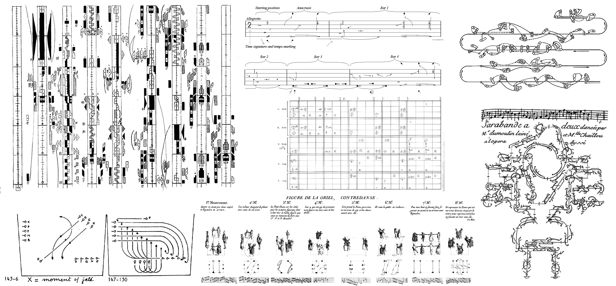
There is a long history of movement notations. Before ubiquitous video capture you had to preserve the developed choreography somehow. Now they are more of a historical curiosity, even though they do look amazing as graphical systems.
Of course, you could also provide simple illustrations of positions, as was done in a book by Golena Voyachkova “Movement - the root of woman’s health and beauty” that came out in the Soviet Union in 1965. It tried to illustrate movement by showing the correct (on the left) and the wrong (on the right) way of doing things.
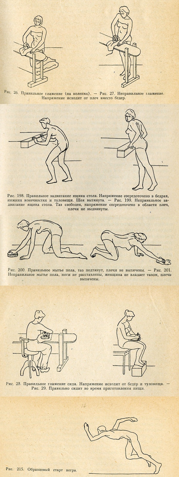
The last image is titled “The exemplary start of the negro”. This book is a good indication how movements were perceived as gender and race specific fifty years ago.
Then again you could describe movement through text:
at Bless Home Berlin.
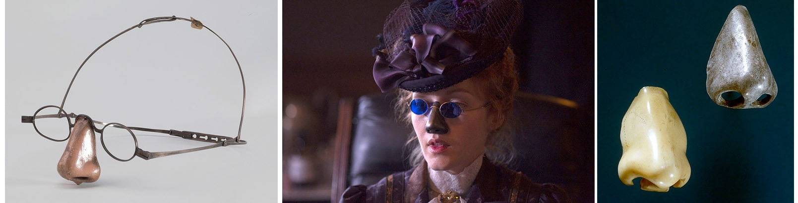
Diseases have always been fashionable. Tuberculosis brought us the fad of looking pale and skinny. Syphilis and it’s symptomatic light sensitivity and rotten noses brought us sunglasses and fake noses that were worn even by those not afflicted by the illness.
I won’t go into detail as to why disease becomes fashionable - first, I don’t really know, and then there’s a whole conference on it.
One point of interest for me is how a fashionable disease is a promise of a physical experience. Similar to a certain subset of internet memes I wrote about before, where a human or a non-human stand-in reminds the viewer of a bodily experience from everyday life.
Smoking in film and fashion can be interpreted in the same way - as a powerful, addictive, self-inflicted bodily experience, as a promise of being highly attentive to the body, the fingers, the mouth and the inside of the lungs.
As smoking becomes much less acceptable socially - and to advertisers - the fashion photography looks for new ways to make the signifier more abstract - the models shown here are not-smoking emptied non-cigarettes.

It would be interesting to test which other bodily experiences could be promised by fashion - besides the obvious promises of eternal youth, sex and drugs. How about being uncomfortable? Being fat using a fabulous fat-suit? Freezing in the winter while wearing a down jacket with huge holes? Not being able to pee, as the process of unwrapping the clothes takes hours? Never being thirsty with a 12-liter water pack hidden in the garment? Feeling unprotected with sleeves that don’t allow your hands to touch your body, combined with an exposed belly?
Include some promise of bodily experience within your work. It changes things.
What is not in this text but could be: - golden teeth and broken nose as a criminal status symbol - movement restricting feathers in male peacocks as a sign of fitness - jewellery made of wearer’s hair for cancer patients - fidget jewellery for autists as described in a previous text
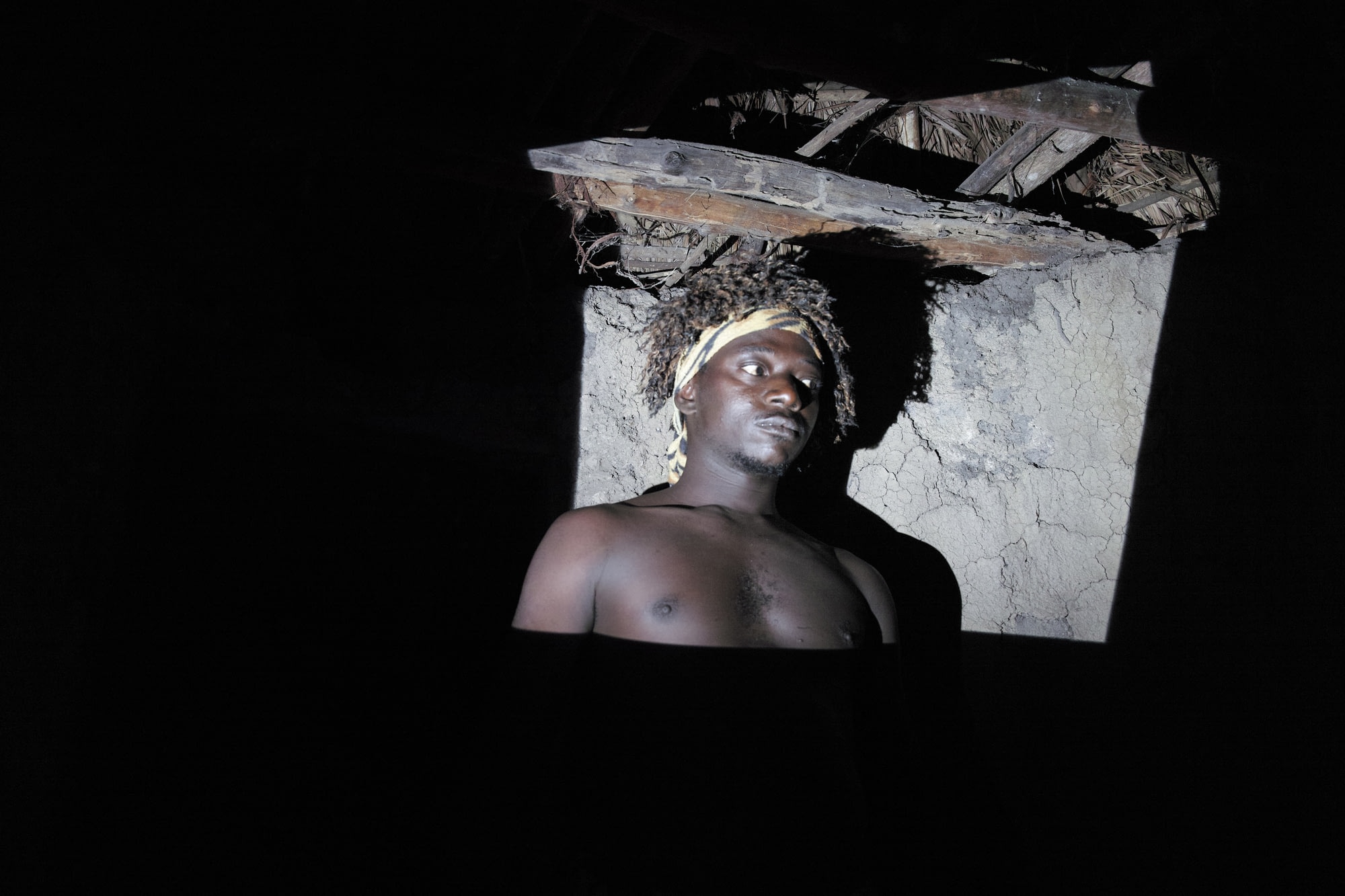
In the winter of 2013 I went to Guinea with a few friends. Guinea is one of my favourite destinations, since Silvia, the mother of my friend Christoph, is working there at a medical laboratory. And having nice people on the ground makes travelling to a foreign country much more enjoyable.
Guinea is an interesting country to visit. It is rich in natural resources, which leads to wealth being concentrated in the hands of a few powerful families. It also means that tourism is non-existent and the only white people present are professionals working at mining companies and NGOs. You can be the only white person in a densely populated area, and you get eyed on the streets - it feels like everything you do would be talked about later, so you end up being not only a guest but also an ambassador for your culture.